Good Eggs design system
Auditing the current system
My first undertaking when I joined Good Eggs was to audit all the components, all the type styles, and all the iconography used on Good Eggs. Good Eggs had just launched a brand refresh that rethought the photography style, color palette, and the typography used for marketing campaigns & materials.
Once the current styles were sorted I identified opportunities to inject some of the new refresh into our product UI. My goal was to create an evergreen system that could blend in with the current, more modern refresh but also withstand Marketing’s experimentation. I chose to adopt some of the new base stylistic elements—such as the color palette—into the updated system. These stylistic changes could be easily evolved in the future to maintain aesthetic alignment.
A sampling of the audit I completed of the components on Good Eggs website & iOS
Project goals
Audit components, deprecate those that are no longer needed, update what will be kept, and then create and maintain Sketch UI library
Clean up the type styles used across the ecosystem and define the font, sizes & weights we’ll be using moving forward and create plugin for use
Define a grid & spacing system and adopt it
Strategically integrate new color palette into UI
Audit existing icons, establish design guidelines, re-draw icons, and create new icon library
Grid system
Each page of GoodEggs.com seemed to live on its own, unique grid system. I defined a cross-platform system that would introduce consistency and organization.
Desktop
18 columns
Tablet
8 columns
Mobile
4 columns
Spacing
I introduced a spacing system comprised of 6 increments, ranging from 4 to 80px.
Typography
The use of fonts was a bit chaotic across web, iOS, and marketing. Typography was where the UI of Good Eggs’ marketplace was going to diverge the most from Marketing visuals. I chose to maintain the current fonts on web. Most consequentially, I cleaned up the breadth of sizes & weights used across the site and created more stringent guidelines that I held myself to when creating new components & page layouts.
Color palette
A new color palette was where the brand refresh had the biggest impact. The old Good Eggs style loved a soft, natural color palette. The refresh introduced a broader range of colors with a philosophy of being more color-forward. I wanted the UI to respect the stylistic change and adopt the broader palette with intention and purpose. Along with a totally new palette the new brand aesthetic introduced the idea of ‘color pairs’ that I wanted to make intentional use of within the UI.
Original color palette
New color palette
Icons
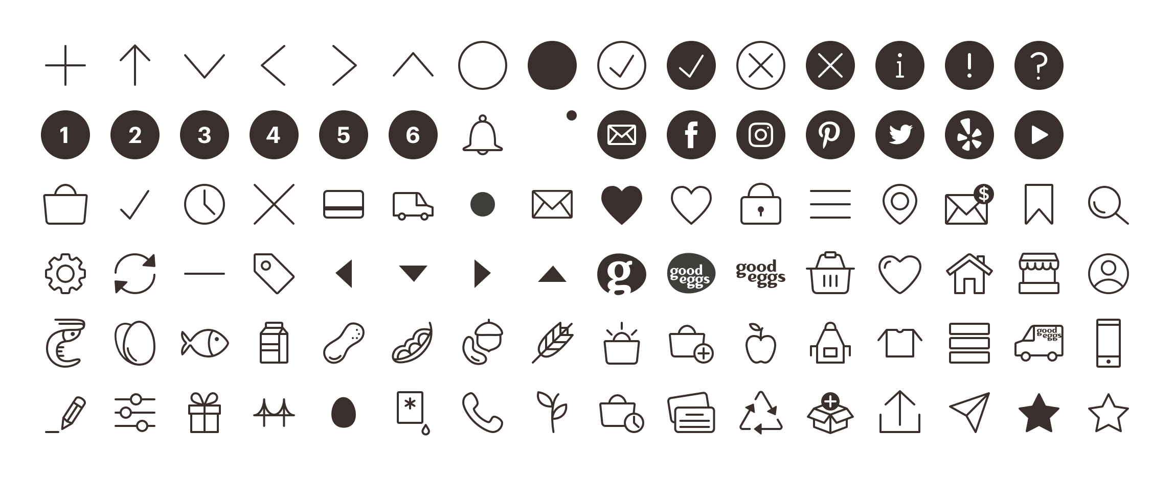
Iconography on Good Eggs was a mish-mash of styles. First, I identified all the icons used on the site and sorted through what each was being used to represent. When I had a distilled list I redesigned all the icons currently being used in a single, consistent style.
The icon library is shared with the marketing team and updated and contributed to quite frequently. It began with 60 icons and now has over 100 icons in the library.


